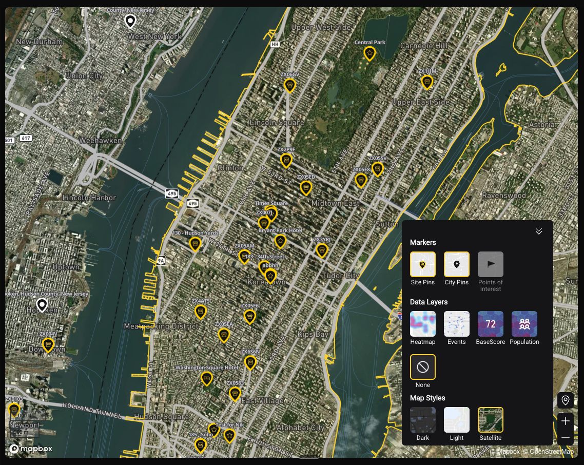
Map views and layers
The three map views, what each is for, and how to control what is displayed.
Three Map Views
You can switch between three views depending on the level of analysis you need. Look for the view toggle in the map controls.
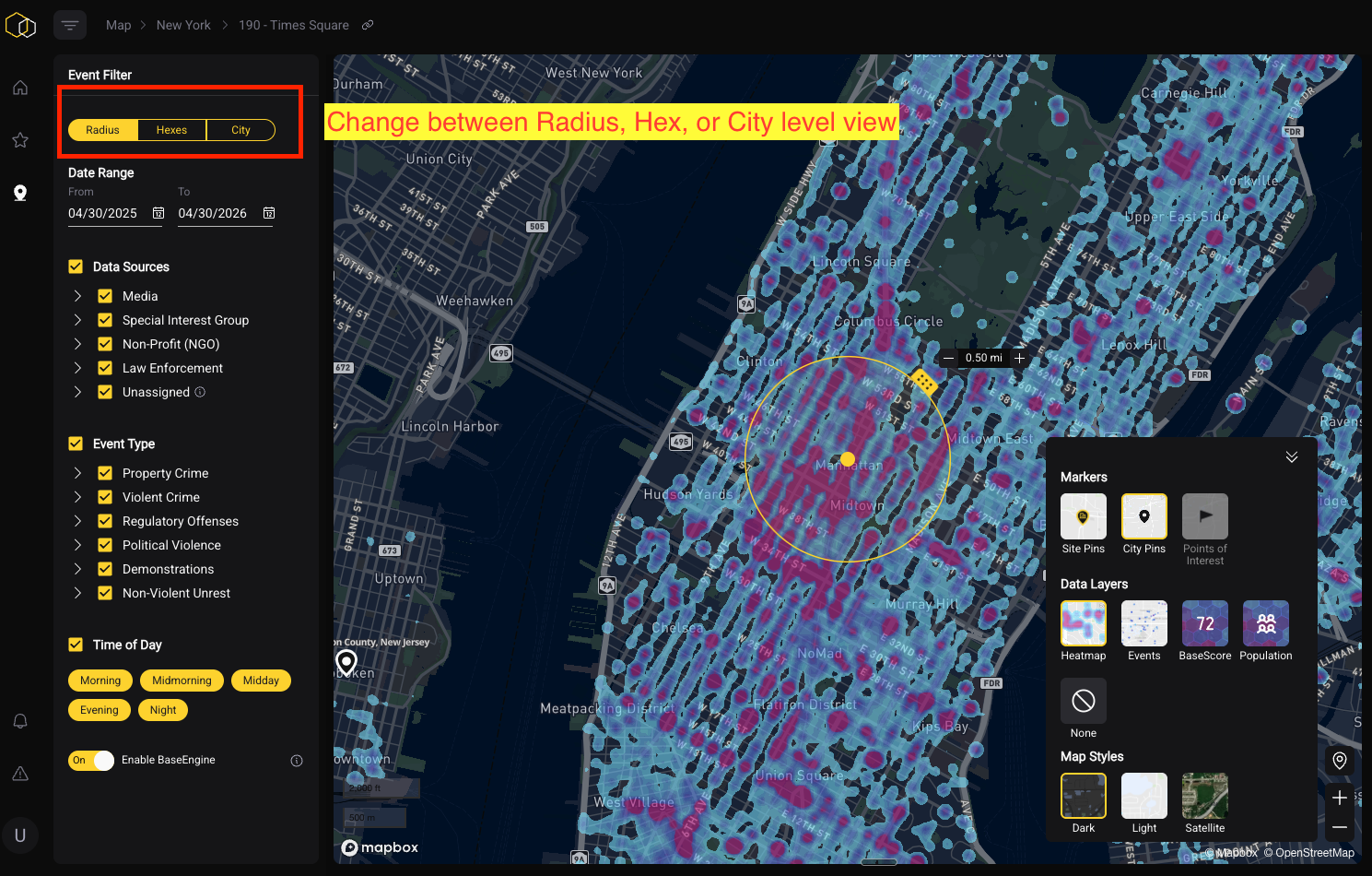
Radius View
The default view. Shows data aggregated within your selected radius around a specific point. Best for: single-site analysis, understanding risk at a specific location.
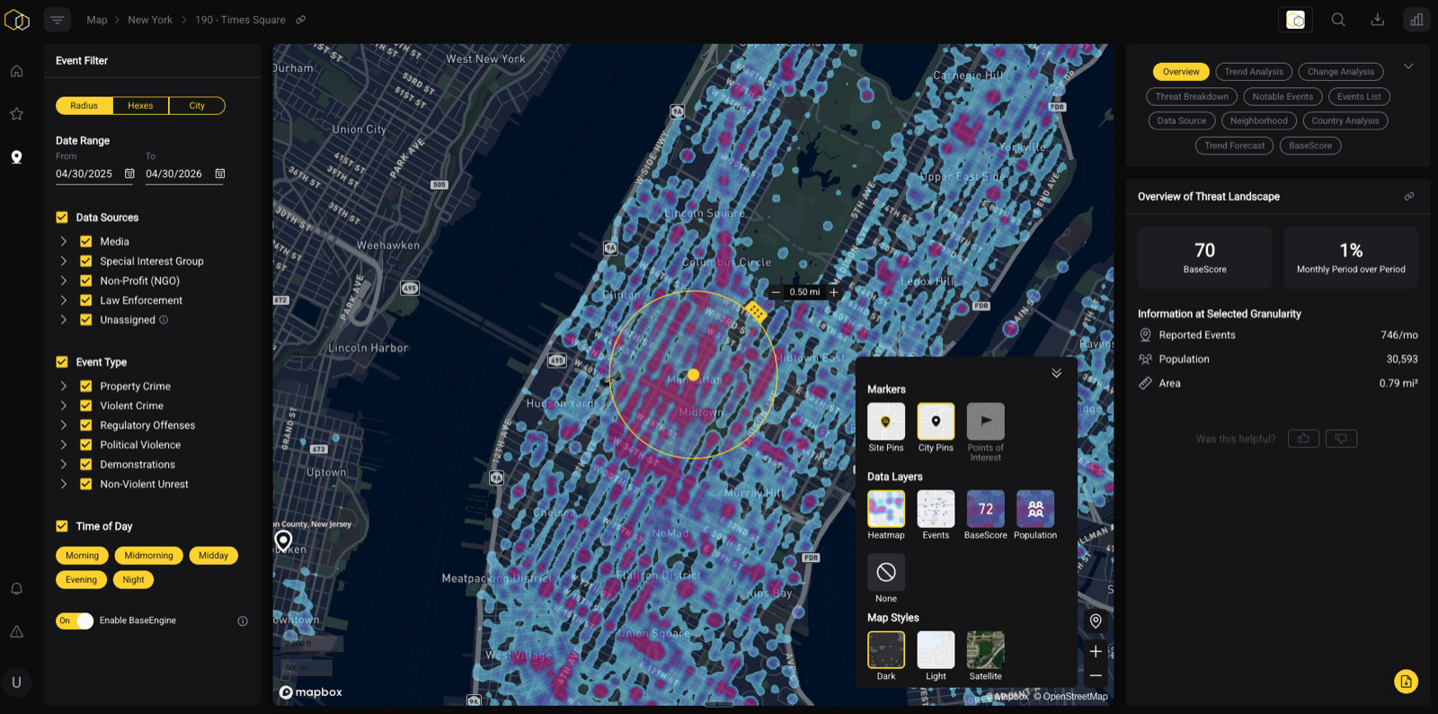
Hex View
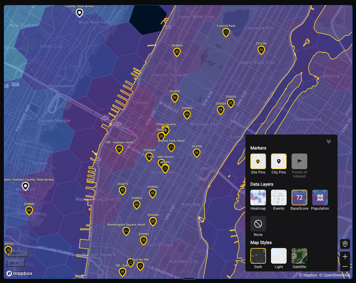
Breaks the map into a grid of hexagons, each representing a small geographic unit. BaseScore and event density are calculated at the hex level. Best for: understanding how risk varies block-by-block, comparing your site's hex to neighboring hexes.
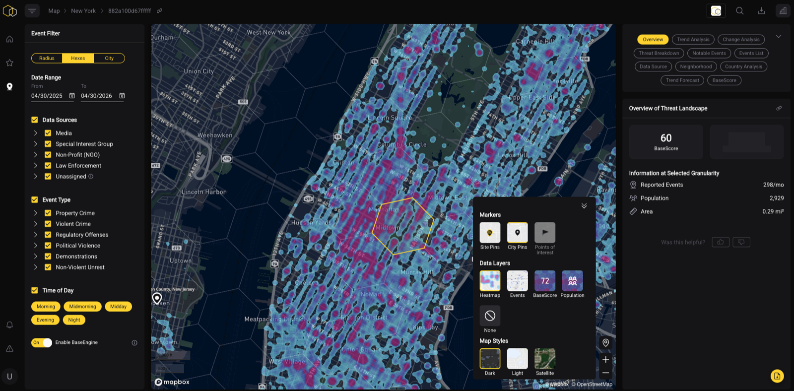
City View
Zooms out to show the city or metro area as a whole, with aggregated risk data. Best for: portfolio-level monitoring, understanding where your locations fall within a city's overall risk landscape.
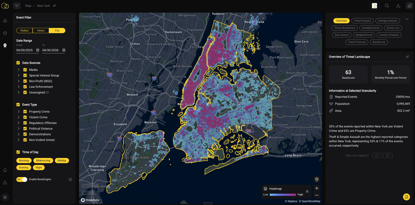
Tip: Use Hex view to answer "is the risk at my specific location higher or lower than the surrounding blocks?" Use City view to answer "how does this city compare to others in my portfolio?"
Viewing BaseScore and Event Data Across Views
Regardless of which view you're in, you can display either BaseScore or event data on the map. Switch between them using the data layer controls. BaseScore will color-code hexes or the radius area by risk tier. Event data will plot individual incidents on the map.
Map Layers
Use the Layers panel to control what's displayed on top of the map. Available layers include:
Location Layers
- Site Pins — marks your saved locations on the map
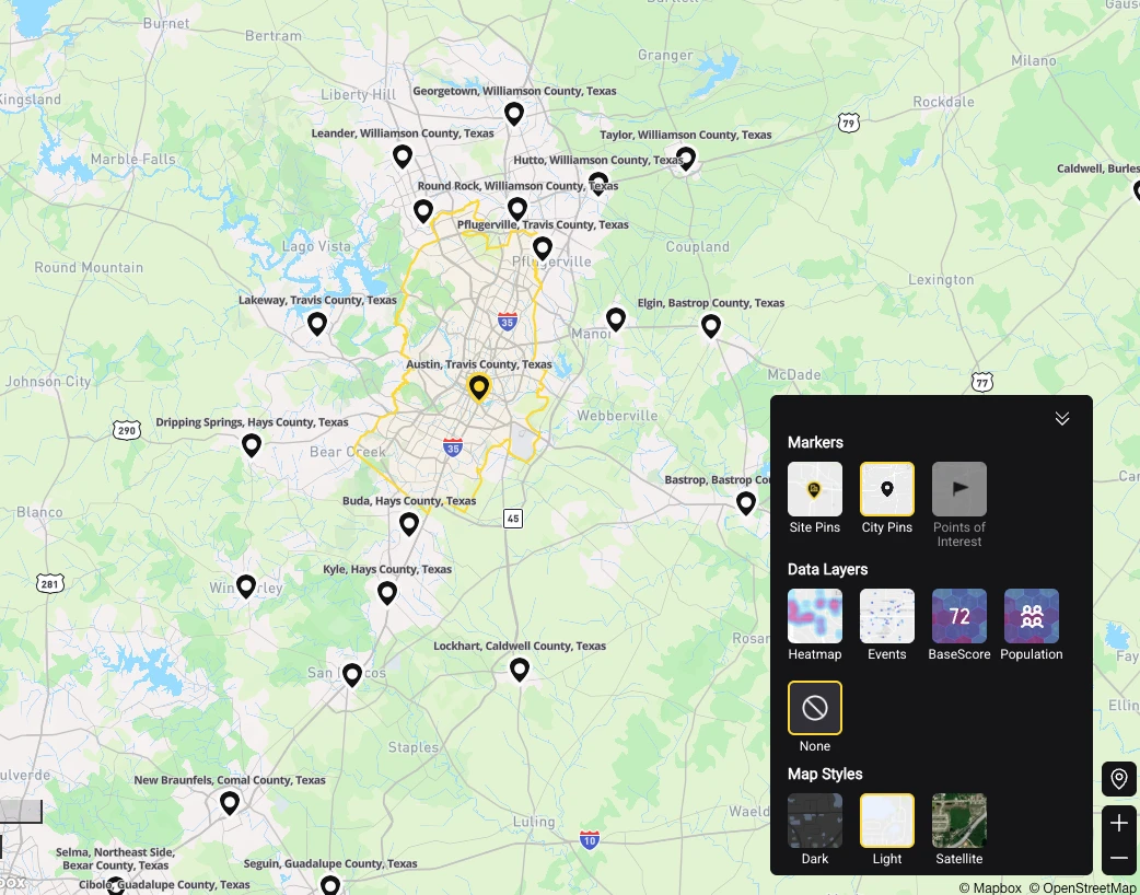
- City Pins — shows city-level markers when zoomed out
- Points of Interest — overlays contextual landmarks (transit stops, hospitals, schools, hotels, etc.) to add environmental context to your analysis
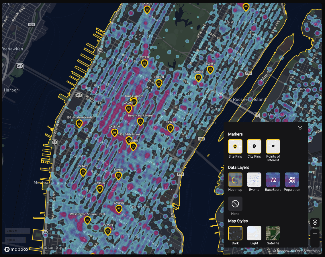
City Pins mark cities rather than your own saved sites, labelled with city, county, and state or country. Turn them on when zoomed out over a region to see which cities are covered around your locations — useful when assessing a metro area, or checking what coverage exists near a site you are considering.
Data Layers
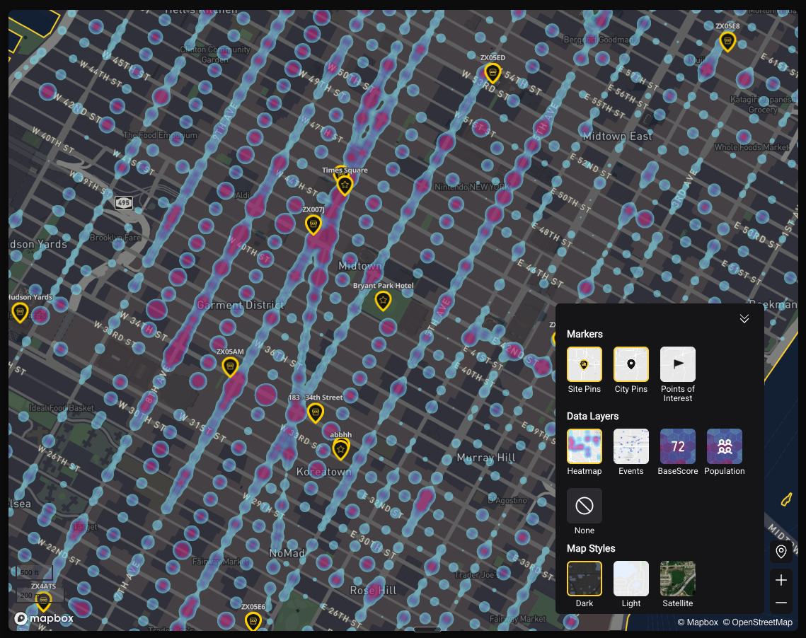
- Heat Map — a continuous color gradient showing concentration of events or risk across the map surface
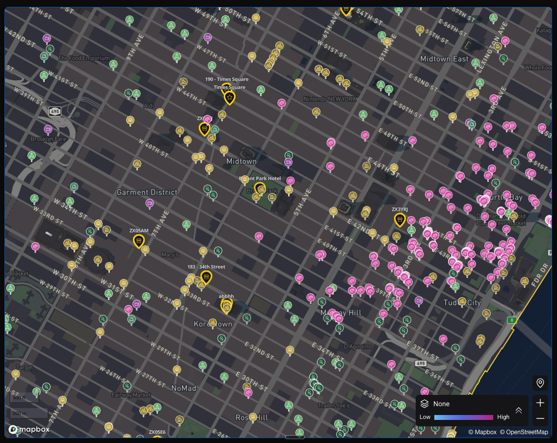
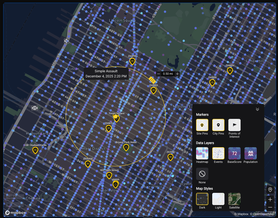
- Events — plots individual incident markers on the map; click any marker to see event details
- BaseScore — overlays BaseScore color-coding (by hex or radius) across the visible map area
- Population — overlays population density, which is useful context for reading event counts: a high count in a dense area is a different signal from the same count somewhere sparse
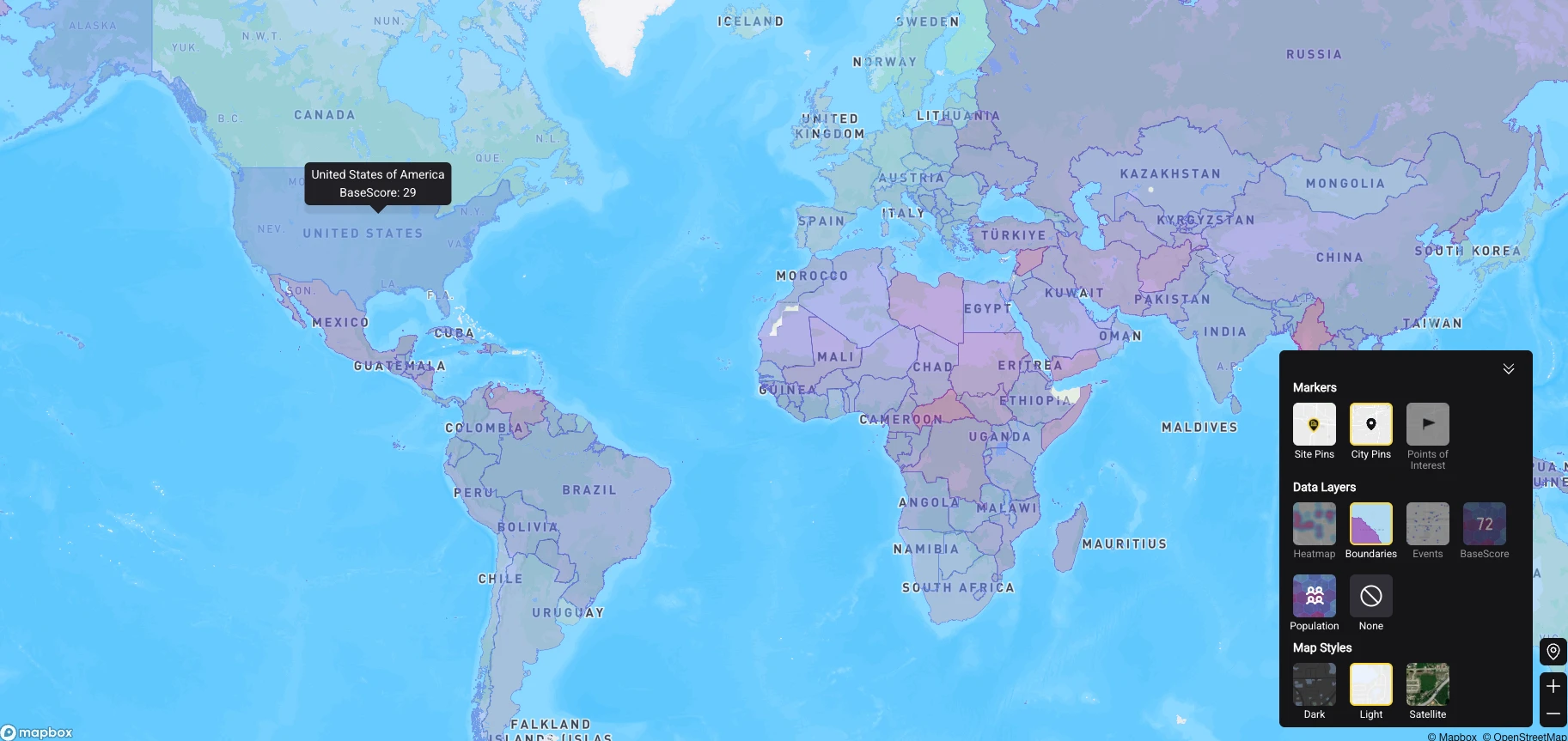
- Boundaries — available when zoomed out, this shades whole countries by their Country BaseScore. Hovering a country shows its score. Good for orienting on a region before drilling into a specific site — and it pairs with the Country Analysis module
- None — turns off data layers entirely, leaving just the base map and any location pins
Which layers are offered depends on how far you are zoomed out — Boundaries appears at the global view, for instance.
Map Styles
Switch between visual styles to suit your preference or presentation context: - Light — clean, minimal background; best for day-to-day analysis - Dark — high-contrast; useful for presentations and dashboards - Satellite — aerial imagery as the base map; useful for site-specific physical context